top of page


PHOTOGRAPHY
![[title of project].png](https://static.wixstatic.com/media/01b040_fb68cdb91381499888bb26b00b8890f4~mv2.png/v1/fill/w_600,h_189,al_c,q_85,usm_0.66_1.00_0.01,enc_avif,quality_auto/%5Btitle%20of%20project%5D.png)
by Erin T.

Though I love it, I’m always unsure of what I'm doing when it comes to art.
It’s always me, stressed out, sure that I’ve put in all this effort only to make a huge load of meaningless nothing.


Then I get pleasantly surprised by people saying,:"This is great!"


It's so jarring.

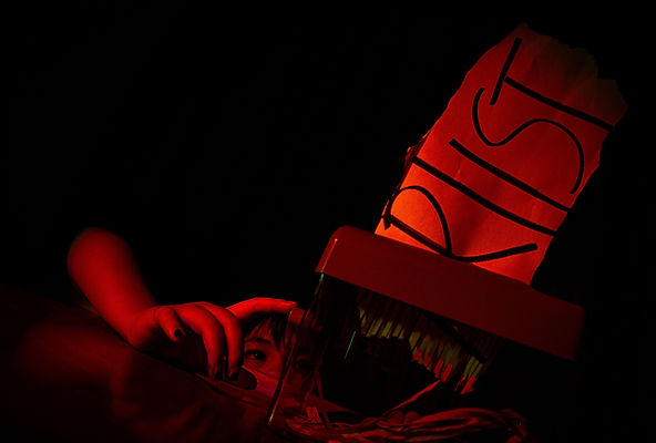
So, to capture that contrast, I used red and green light (complementary colours),

as well as a shallow depth of field and a lack of negative space, to make this project feel more personal.

After all, art is personal...
in the end, what is it besides a reflection of the self?

bottom of page